How to Choose the Right Countertop Colour for Your Kitchen
You’ve been staring at paint swatches, cabinet samples, and countertop chips for weeks. Everything looks amazing in the showroom. Then you get home, hold the sample up against your cabinets, and suddenly nothing feels right.
Sound familiar? Countertop colour is one of the most stressful decisions in a kitchen remodel and also one of the most permanent. Get it right, and your kitchen feels pulled together and timeless. Get it wrong, and you’re living with that decision for the next 15 years.
Here’s what actually helps you make the right call.
Start With What You’re Already Keeping
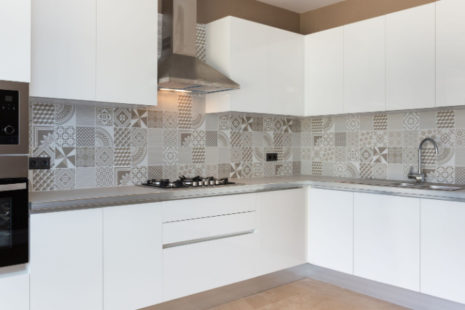
Before you fall in love with any countertop colour, take stock of what isn’t changing. Your flooring, cabinet finish, and appliance colour are your biggest anchors — and your countertop needs to work with all three. If your cabinets are a warm espresso or honey oak, a stark white countertop can feel disconnected and cold. A warm cream, soft beige, or veined brown will feel like it genuinely belongs. Cooler gray or white cabinets, on the other hand, pair beautifully with crisp whites, soft blacks, or cool-toned marbles.
Quick things to note before shopping:
- Cabinet colour (stained wood, painted, or thermofoil finish)
- Flooring tone (cool gray tile vs. warm hardwood planks)
- Appliance finish (stainless steel, matte black, or panel-ready)
- Backsplash, if you’re keeping the existing one
Light vs. Dark: The Real Trade-Offs
This is where most homeowners get tripped up. Light and dark countertops both look stunning but they behave very differently in a real kitchen.
Light countertops (whites, creams, soft grays):
- Make a kitchen feel larger and more open
- Show crumbs, spills, and water spots more easily
- Work well in smaller kitchens or spaces with limited natural light
- Tend to photograph beautifully if resale value matters to you
Dark countertops (black, charcoal, deep brown, navy):
- Hide everyday messes and food debris surprisingly well
- Show dust, dried water drops, and fingerprints on glossy finishes
- Add drama and weight — great for balancing light or all-white cabinetry
- Can make a small kitchen feel more enclosed if not balanced with good lighting
There’s no universally right answer here. It comes down to your lifestyle. If you have kids, cook often, or just don’t want to wipe counters three times a day, a mid-tone or patterned surface will be your best friend.
How Undertones Can Make or Break the Whole Room
This is the detail most people miss, and it’s the one that causes the most regret. Every countertop colour has an undertone a subtle shift toward warm (yellow, red, beige) or cool (blue, green, gray).
If your cabinet paint has warm undertones and you pick a countertop with cool gray undertones, those two materials will fight each other every single day. They won’t look like they were chosen together they’ll look like they were chosen separately. Because they were.
Here’s a simple rule: match the temperature. Warm cabinets get warm countertops. Cool cabinets get cool countertops. When in doubt, go neutral — a true greige or soft white with balanced undertones is one of the safest, most timeless choices you can make.
Think About the Finish, Not Just the Colour
Colour gets all the attention, but finish has just as much impact on how a countertop lives in your home.
Polished or glossy finishes reflect light beautifully and feel luxurious, but they show every smudge and water mark. Honed or matte finishes have a softer, more organic look and hide daily wear better but they can be more porous depending on the material.
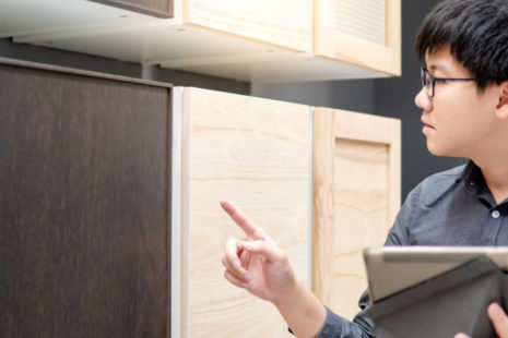
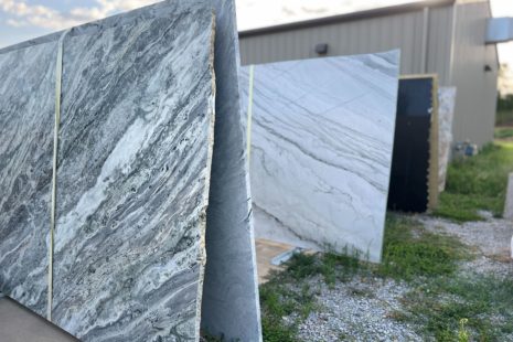
If you’re looking at quartz, you’ll have more control over finish than with natural stone. Granite and marble vary slab by slab, so always view the actual slab before committing, not just a small sample chip.
Don’t Pick in a Vacuum — Test It at Home
Showroom lighting is designed to make everything look incredible. Your kitchen lighting is not.
Always bring a large sample home at least 6 inches square if possible and look at it in your actual kitchen at different times of day. Morning light, afternoon sun, and evening LED lighting will all change how the colour reads.
Hold it next to your cabinet doors. Set it on your floor. Live with it for a day or two. This one step alone saves more remodeling regrets than any other.
The Colores That Hold Up Over Time
Trends come and go. That terracotta countertop might feel exciting right now and dated in five years. These are the palettes that have consistently stood the test of time:
- Soft white with subtle veining (classic, endlessly versatile)
- Warm greige or taupe tones (works with almost every cabinet colour)
- Soft black or dark charcoal (bold but timeless, not trendy)
- Light gray with warm undertones (modern without being cold)
- Natural wood or butcher block for a section (adds warmth and character)
If you want to add personality, put it in your backsplash or hardware. Those are easier and cheaper to change down the road. Your countertop should be your anchor, not your statement piece.
Ready to Stop Guessing and Start Deciding?
Choosing the right countertop colour is so much easier when you can see real options in the context of a real kitchen — not just a chip under fluorescent lights.
Our team works with homeowners every day to match countertop colours to their specific cabinets, flooring, and lifestyle. We take the guesswork out of it so you can feel confident before anything gets ordered or installed.
Come visit our showroom, bring your cabinet door or a photo of your space, and let’s find the right fit together. Or if you’d rather start from home, reach out today for a free consultation and quote. Your kitchen deserves to be something you love not something you settle for.